Last updated: 12/20/2021.
Data Geek Alert!
The data presented here should NOT be your sole metric for making decisions about your personal health and safety. Always listen to advice and directives made by Federal, State, and Local health experts!
Open this tab to learn about how we collected and presented this data.
To compile this information, we utilized NYC Department of Health’s public COVID-19 github data accessible via NYC Open Data. Please refer to the readme for this dataset for complete caveats and qualifiers. For compiling Bay Ridge’s COVID history, we used the daily GIT commits for zip code 11209, utilizing the data-by-modzcta.csv dataset.
Please note that this data contains occasional “null” entries, reflecting dates where the city data was not updated.
Additionally, the datasets are always continually cleaned and updated resulting in seemingly odd day-to-day data changes. These instances often reflect hospitals and health agencies updating their data to reflect new information, such as a case being assigned to the wrong zip-code.
Thus, it is important to note that this data is not exact. The data provided should be used to infer general trends only, as represented by our moving 7-day averages.
The data for this visualization is freely downloadable on the Tableau website.
Interpreting This Data…
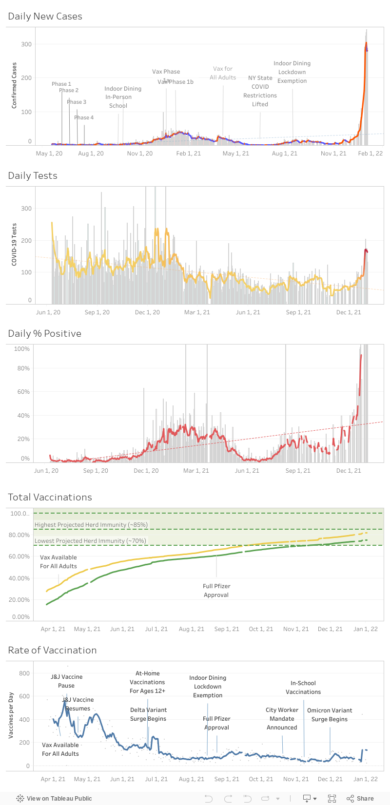
You’ll notice two elements to each graph: a bar graph, and a line graph. The bars show the daily totals for each statistic. The line shows the 7-day average. Hovering over a specific date will show more details and exact numbers.
In our Daily New Cases graph, the line graph color changes based on whether the average is rising or falling: red for rising, blue for falling. In our Daily Tests graph, the color of the line becomes warmer the more positive tests were found on that day. This helps to highlight if an increase in testing has been prompted by an increase in positive tests, or another external factor.
If lines are so long, why does the data indicate so few tests?
The city data we use only counts molecular tests, usually done in a laboratory setting. This excludes antigen (i.e. Rapid Testing) which is usually the more prevalent form of testing. So when you see only 75 tests have been made on a day where you saw lines wrap around the block for rapid tests, that’s why!
Also, yes. This means that the COVID case rate that we list does not show the results of antigen testing in terms of positivity. The official city data only considers a molecular test a “confirmed” COVID case. The actual numbers may be much higher when rapid testing is considered, even factoring in its higher false-positive rate.
Learn more about the kinds of COVID Testing methods.
Why are there gaps?
This data is collected from the NYC Department of Health, and some days did not see an update to zip-code level data. Other days had data retroactively adjusted for accuracy. The moving 7-day average (line graph) is thus a more accurate indicator of overall trends since it smooths these errors out.
Additionally, individual numbers for testing were not available at a zip-code level before June 10th, 2020.
Also, as of the latter half of 2021, the raw tracking data on the Department of Health GitHub stopped being updated on weekends and federal holidays, resulting in a major reduction in data that has caused our daily case rate data to become much less refined.
What’s that spike in Mid-August of 2020?
The mid-August spike, that nearly exceeded a 5% average positivity rate, corresponds to a Sunset Park localized outbreak. City officials later determined that the outbreak was not widespread but centered on specific households and illegal large-gatherings in Sunset Park. However, the city didn’t publicly confirm through contact tracing that any of the large-gathering Karaoke parties (which were raided and shut down) were the source of the outbreak.
Considering that Bay Ridge experienced a COVID-19 spike, it’s doubtful that the August outbreak was solely due to isolated events and households within Sunset Park, as was widely reported.
These spikes should also serve as a strong reminder that localized outbreaks and community spread is a very real possibility, even when overall city numbers appear to be going down.
Is this data useful in determining if local schools are safe?
No.
Our schools are attended by staff and students from many different zip-codes, which this data does not capture. Zip-code level data cannot and should not be used to prove classrooms are safe.
Where is the rest of the vaccination data? Why does it start in late April?
We were relying on a third party github that had been pulling data from the NYC Department of Health’s vaccination tableau, since the official github was not active at that time. As such, the start date for vaccination data is when that enterprising soul started collecting the data. If the city ends up properly publishing back data, we will fill in the earlier dates.
What’s the deal with Herd Immunity?
Herd Immunity isn’t a set number. Estimates can and have fluctuated over time. For example, the percent we need to vaccinate will depend on the kind of variant, since some variants spread more easily than others. As such, we’ve included the highest and lowest estimates for herd immunity in our graph.
Note that reaching herd immunity doesn’t mean you are immune. It means that community spread is much more difficult, and that small outbreaks will not spread too far. However, if you are not vaccinated, you still remain exposed to small outbreaks, especially among others who have not been vaccinated.